Wednesday, February 08, 2006
Wednesday, February 01, 2006
Achievements...
I know this is well over due... so here goes...
I took a bunch of pictures and umm... I hope youll like em!
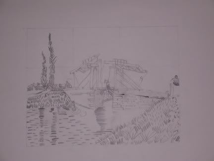
You all have already seen this one... but here it it again. This was my very first drawing in art class...and I am very proud of it!
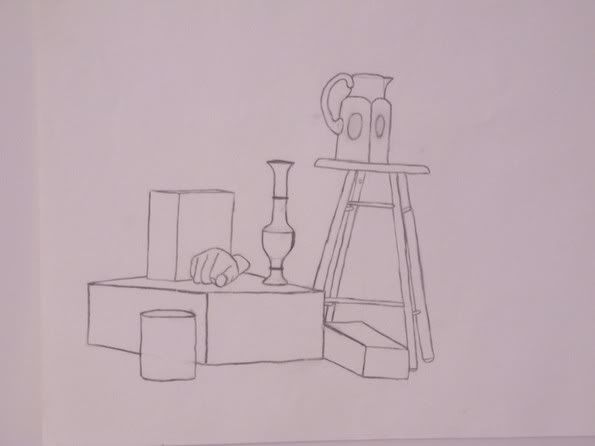
Now this is my first still life. I liked a lot when I did it...but as the class went on... I got to learn that trying to attain perfection not necessarily a good thing. Now to me straight lines seem so boring. A plain simple pencil drawing isnt anything special.... But still... not a bad start...
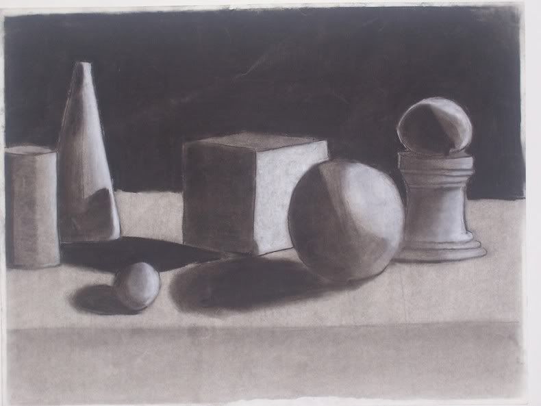
Now this is my first still life done using charcoal. And to be honest and straight forward... I really dont like it... I could possibly use the H word for this drawing... but oh well...
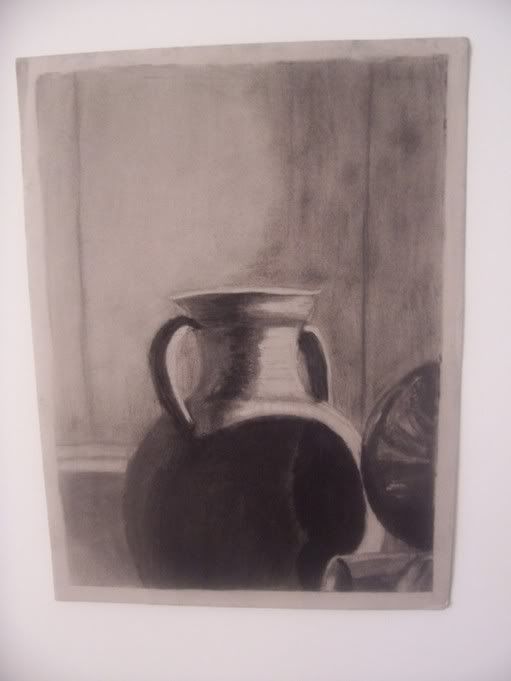
Here is another still life. The object on the lower right side is another pot just like the one you can see, but just places sideways. I really liked how I showed the reflective work on that pot. The blurry lines in the back were actually part of the wall in the setting. The blurriness gives it some sort of definition of space. I do not like how I curved the shadow part on the wall... but I think this was the first time I was trying to use this concept.
What it is that,.. when you draw you are not supposed to draw actual lines...because in a composition in real life...there are no real lines. You just get a perception of it because there is a change in the positive and the negative space. So what they do is that the background of the lighted side of the composition goes into the shadow.. and the background of the shadow part of the composition looks like it is in the light.
Read that and look at the picture and you will know what I am talking about... That way you will have a light object and behind it a dark background... so you can transform from positive to negative space without the use of a solid line.
I think its a very interesting concept... and it still gives you a perception that there is a real line there...but its only your eyes playing tricks. However... there are parts in the above pic where you can see the real lines... but most of it is well balanced...
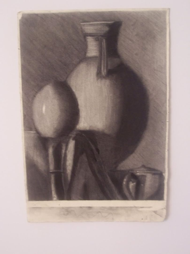
This is definately my favorite...I cant wait to put it up on a wall! The picture didnt come out that great...it looks a little blurry... but oh well...
So its another still life...
I absolutely love the tea pot on bottom right. The little details look wonderful.
On the egg... I liked how I got rid of that line that I talked about earlier... And on that pot...I love how it stands out. The lines on the charcoal give it that circular look...and I used an eraser over the charcoal to get it... its clearly visible on the top of the pot. Its amazing... I dont think one would ever see an eraser as a medium to draw.
What I dont like in the pot is that the line is visible on the left side. Getting rid of it was hard... becuase it all depends on the type of paper you use.. And this time the charcoal actually stuck to the paper...
I dont like the drapery between the egg and the pot...
It was a cloth placed on a box... And on a whole I just suck with drapery...
Also notice the slanted downward strokes of charcoal that I used in the background. I think that too makes this picture what it is..
I LOVE IT! LOL
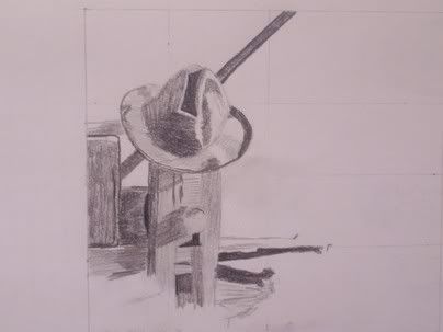
This is a small scale pencil drawing ... And I think it is incomplete...LOL
But I still like it!
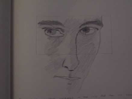
This is what we did to try to understand the human form...
Even though the eyes are crazy and crooked... I think they still look kinda powerful... Especially the right eye....
(Step back and take a look...!)
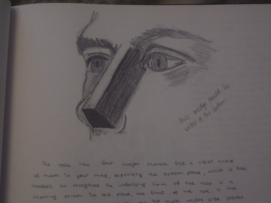
And another one with the eye and the nose...
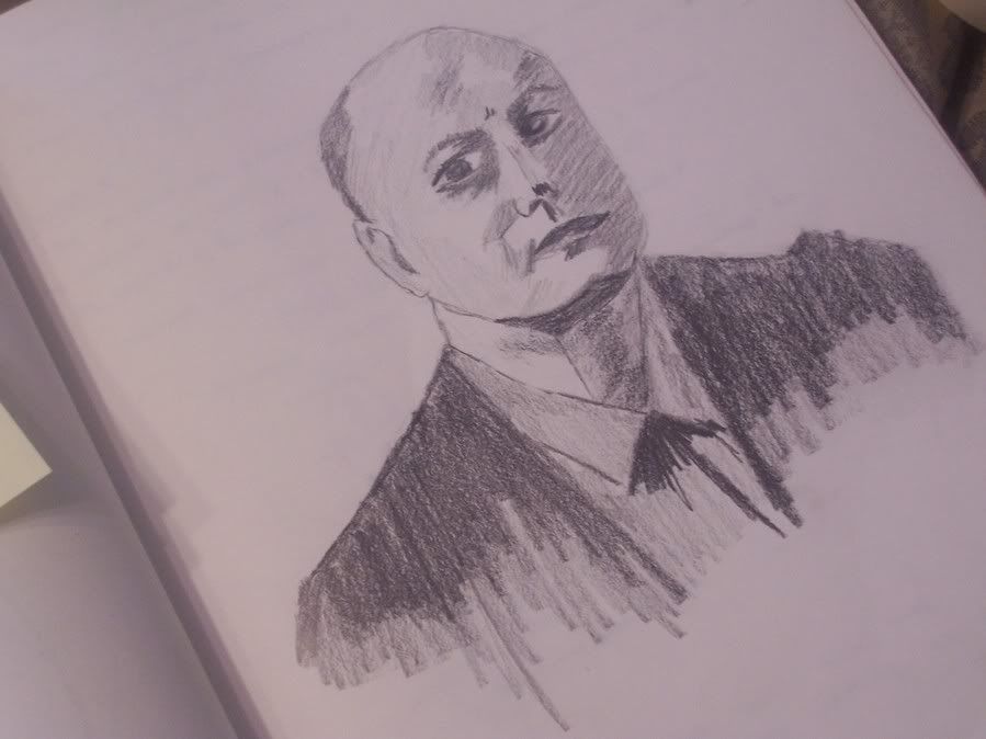
This is Edward Hopper... A self portrait..
It looks not so good...
LOL
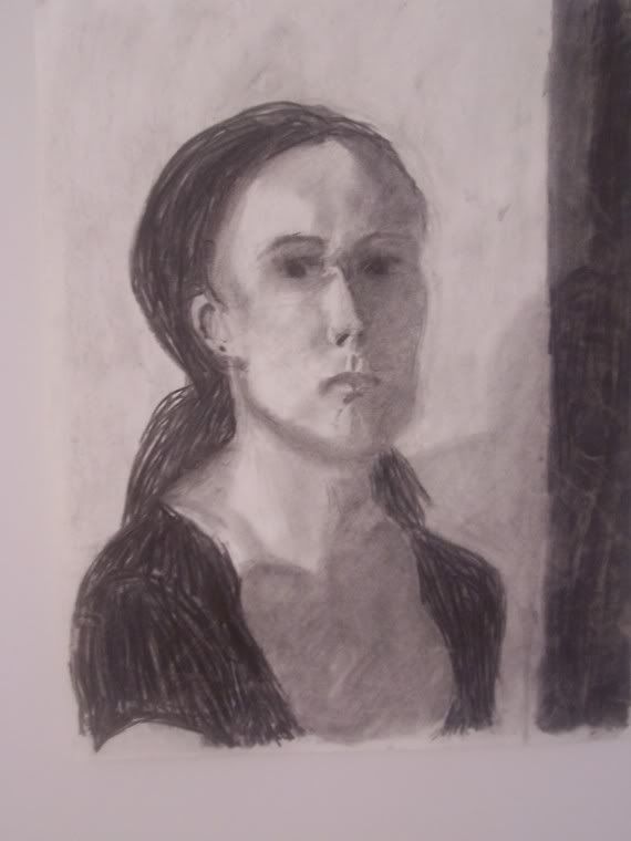
And finally, this is the portrait we did in class. It could have definately been better...but I think I like how the face came out...
The human face is so complicated...
And you have to follow rules about poportion..
Again.. many things on the face are decieving...
I think in this one.. right side of her face loooks good by itself and the same for the left side.
You put em together...and it just doesnt look right...
I didnt do them as 2 different pieces...but iit does sort of look like I have.
I really like the nose..the eyes are okay...and the lips horrible...
The eyes and lips gave me a very hard time... But in the end I like what I did...
So there you go... I have been wanting to do this for a while... and I am glad I finally have..
I cant wait to get my hands on some more charcoal and see what I can create!!!
I took a bunch of pictures and umm... I hope youll like em!

You all have already seen this one... but here it it again. This was my very first drawing in art class...and I am very proud of it!

Now this is my first still life. I liked a lot when I did it...but as the class went on... I got to learn that trying to attain perfection not necessarily a good thing. Now to me straight lines seem so boring. A plain simple pencil drawing isnt anything special.... But still... not a bad start...

Now this is my first still life done using charcoal. And to be honest and straight forward... I really dont like it... I could possibly use the H word for this drawing... but oh well...

Here is another still life. The object on the lower right side is another pot just like the one you can see, but just places sideways. I really liked how I showed the reflective work on that pot. The blurry lines in the back were actually part of the wall in the setting. The blurriness gives it some sort of definition of space. I do not like how I curved the shadow part on the wall... but I think this was the first time I was trying to use this concept.
What it is that,.. when you draw you are not supposed to draw actual lines...because in a composition in real life...there are no real lines. You just get a perception of it because there is a change in the positive and the negative space. So what they do is that the background of the lighted side of the composition goes into the shadow.. and the background of the shadow part of the composition looks like it is in the light.
Read that and look at the picture and you will know what I am talking about... That way you will have a light object and behind it a dark background... so you can transform from positive to negative space without the use of a solid line.
I think its a very interesting concept... and it still gives you a perception that there is a real line there...but its only your eyes playing tricks. However... there are parts in the above pic where you can see the real lines... but most of it is well balanced...


This is definately my favorite...I cant wait to put it up on a wall! The picture didnt come out that great...it looks a little blurry... but oh well...
So its another still life...
I absolutely love the tea pot on bottom right. The little details look wonderful.
On the egg... I liked how I got rid of that line that I talked about earlier... And on that pot...I love how it stands out. The lines on the charcoal give it that circular look...and I used an eraser over the charcoal to get it... its clearly visible on the top of the pot. Its amazing... I dont think one would ever see an eraser as a medium to draw.
What I dont like in the pot is that the line is visible on the left side. Getting rid of it was hard... becuase it all depends on the type of paper you use.. And this time the charcoal actually stuck to the paper...
I dont like the drapery between the egg and the pot...
It was a cloth placed on a box... And on a whole I just suck with drapery...
Also notice the slanted downward strokes of charcoal that I used in the background. I think that too makes this picture what it is..
I LOVE IT! LOL

This is a small scale pencil drawing ... And I think it is incomplete...LOL
But I still like it!

This is what we did to try to understand the human form...
Even though the eyes are crazy and crooked... I think they still look kinda powerful... Especially the right eye....
(Step back and take a look...!)

And another one with the eye and the nose...

This is Edward Hopper... A self portrait..
It looks not so good...
LOL

And finally, this is the portrait we did in class. It could have definately been better...but I think I like how the face came out...
The human face is so complicated...
And you have to follow rules about poportion..
Again.. many things on the face are decieving...
I think in this one.. right side of her face loooks good by itself and the same for the left side.
You put em together...and it just doesnt look right...
I didnt do them as 2 different pieces...but iit does sort of look like I have.
I really like the nose..the eyes are okay...and the lips horrible...
The eyes and lips gave me a very hard time... But in the end I like what I did...
So there you go... I have been wanting to do this for a while... and I am glad I finally have..
I cant wait to get my hands on some more charcoal and see what I can create!!!
